
In case you're wondering, we're talking typefaces here, and, specifically, the one Woody Allen has used in the titles of most of the films he has directed.
Windsor is a playful display face with heavy rounded serifs designed by Elisha Pechey in 1905 for the Sheffield type foundry Stephenson Blake. Times New Roman it ain't. It's the kind of typeface you might have expected to have seen in adverts pasted on to the sides of buildings in London or New York a century ago. Today it announces Woody Allen as surely as Johnston type does the London Underground.
The story goes that Allen was looking for a typeface for Love and Death (1975). At the time he ate breakfast in the same New Jersey diner as Ed Benguiat, the great American typographer (and jazz percussionist), who recommended Windsor. Allen liked it, and that was that. Windsor became a signature of his films, along with old jazz tunes, thick-framed specs, fast-paced dialogue and neurosis.
Article source: The Guardian
Windsor typeface
Capitals M and W are widely splayed, P and R have very large upper bowls. The Lowercase a, h, m and n of the Windsor font have angled right hand stems, e has an angled cross-stroke. Besides the basic font it is also available in two other styles, Light and Roman. Various foundries introduced minor variations so that today there are versions by Linotype, Elsner+Flake, URW++, Mecanorma and Stephenson Blake.
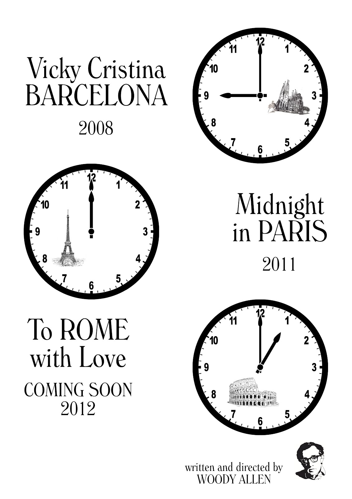
Movie posters: Kairike (Photoshop, InDesign)
No comments:
Post a Comment